DC NEW 52: Light Reading for Dark Knights
BATMAN: THE DARK KNIGHT #1 – 5 (DC COMICS) Paul Jenkins, writer/co-plotter; David Finch, penciller/co-plotter; Richard Friend, inker; Alex Sinclair, colors #1-2; Jeremy Cox, colors #3-5; Sal Cipriano, letters.
I’m currently reading 4 separate Batman-family titles from The New DC 52: BATMAN; BATMAN AND ROBIN; BATMAN, THE DARK KNIGHT; and BATWOMAN. While I enjoy them all - - the monthly wait for the next installment causes the most anxiety with BATMAN and the least amount of impatience with BATMAN, THE DARK KNIGHT. I can handle the wait for a new issue of BATMAN, THE DARK KNIGHT the easiest of any book in the quartet. It ranks fourth and last in popularity with me - - but that doesn’t mean it’s not worthwhile. I’m just not treating it as seriously as I do the other books. While there are signs that writer Jenkins is building towards something (and perhaps holding back a bit until this first storyline concludes) as well as the introduction of some interesting new characters - - - I view BATMAN, THE DARK KNIGHT as more of a pure action book. BATMAN has the darkest tone and explores at length the legacy and history of both Batman and Gotham City. BATMAN AND ROBIN is a classic study of father-son dichotomy and conflicts in trust and respect. BATWOMAN seems to have a supernatural tone, and also dwells in matters of personal development and character crisis and anguish. All three of those books pack a lot of information and move forward at a quickened pace. BATMAN, THE DARK KNIGHT just seems more straightforward as it slowly unravels its story.

I’m a fan of a good story combined with good art. If I have to sacrifice one of those, it normally is the art. I will hang around much longer if the story is good. But if the art is average and the story doesn’t rise above it, then I’m gone and moving onto something else to read. What keeps me coming back to BATMAN, THE DARK KNIGHT is the fantastic art of David Finch. While the story does contain some promising elements it concentrates more on the action aspects of the plot and leaves little time for much else. The art dominates, so much so that every issue features some half-page, full-page and sometimes double page illustrations - - none more so than in Issue #5. The only thing that keeps me from dropping this from my reading list is the absolutely gorgeous work of Finch and the rest of the art team. Even though there is less text to read in an issue of BATMAN, THE DARK KNIGHT - - I’m still spending 20-30 minutes or longer to finish an issue mainly because I’m taking more time to study and admire the art before I turn the page. In that respect, I’m ranking this book much higher than the other book that I’m also buying mainly for the great art: JUSTICE LEAGUE.
However, in the past my fascination with titles with mostly great art begins to diminish after a certain number of issues - - and if the story doesn’t at least try to rise up to the same level of excellence as the art then I end up dropping it from my reading list. I know that the beginning story arc of BATMAN, THE DARK KNIGHT ends at issue #6 (the perfect size for a trade paperback, of course) even though it segues into a new story in Issue #7 that features one of the primary villains in the first storyline. The preview for Issue #8 seems like a logical breaking point, and that’s where I just might stop.
SO, WHAT HAPPENS IN THIS TITLE? Rather than summarize some of the plot elements and reveal what the main conflict is in the first five issues, I’m going to avoid spoiling by trying my best not to address that at all in this review. I think I can still include enough information here to help someone decide whether or not they want to check out this title.
EVERYTHING REVOLVES AROUND THE ART, AND RIGHTLY SO: There aren’t that many artists out there with the diverse set of skills that Finch possesses. He is a true master of detail as well as a master of depth. You can get dizzy looking at some of his cityscapes, overhead views, long shots, and close-ups viewed from on-your-back-and-gazing upwards. He also draws a mean fight scene.
Here are some things from Issue #1 that caught my eye: Batman drops from the Bat plane in a luscious two-page illustration viewed from ground level, with the rappel line snaking over Batman’s head and back to the open bay of the plane. You can see every stitch on the duffel bag Batman is holding. You need to turn the book 90 degrees to the right to get the correct perspective on this scene. Amazing! Likewise, you’ll need to turn the cover to Issue #1 at least 45 degrees to the right to fully appreciate how Finch has incorporated all the building dimensions in the background with the proper depth. It’ a little disappointing that the covers to the succeeding issues fail to catch the attention to this same degree. An eye-popping cover never hurt books sales. I also love the outbreak of crazed Arkham inmates that stretches across the top half of two pages.
Issue #2 has visually stunning opening double-spread credits page that puts the viewer right in the middle of battle and almost on top of the two protagonists. Issue #3 matches similar thrills with a double-pager that has curving credits almost pushed off the front of the page while a major villain seemingly rips apart in transformation. Issue #4 has a mid-air battle during a heavy storm that drips action from page edge to page edge. The capper is Issue #5 with two major DC characters engaged in a mega-punch-out lavishly depicted in big panels. Whew!
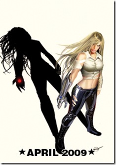
SOME THINGS THAT SHOW PROMISE FOR FUTURE STORYLINES are two new interesting characters and one that is an average villainess but drop dead gorgeous (White Rabbit). The new characters are:
1) Lieutenant J. Forbes from Gotham P.D. Internal Affairs who is determined to find evidence showing Bruce Wayne is illicitly funding the law-enforcement-defying vigilante Batman as well as connect Police Commissioner Gordon to these events. He’s brash, arrogant and in-your-face.
2) Ms. Jaina Hudson, another looker with long legs (also long on innuendo when she flirts with Bruce Wayne) to provide a new romantic interest. Her inclusion allows Jenkins to flash some of his writing skills. He handles the flirtation between Jaina and Bruce in realistic fashion and utilizes their dialogue to establish some true magnetism between them. Their conversational exchanges are more provocative and sexy than any bedroom scene depictions could ever convey. Bravo for the mature handling of these stimulating scenes.
THERE IS AN UNDERLYING THEME/CONCEPT that crops up in Issue #1 and returns in the other issues that is directly related to the main storyline but underneath it alludes to a critical component of Batman and tries to answer a question related to his psyche: what, if anything, is it that Batman truly fears? Fear is defined or spoken of in various captions that hint at who the narrator is but don’t get specific. The speaker may also change from one set of captions to another. I’m just really enjoying the clever way this is being threaded throughout the issues. I’m guessing that this is part of the script that Jenkins is solely responsible for. I remember a very creative examination of the Green Goblin written by him many years back and wonder if we’ll be treated to a similar psychological analysis here. If so, I look forward to that.
So, there is enough going on here to keep me coming back every month for now. My overall ranking for this title is a solid B+ - - and I do like it.

Comments
Post a Comment